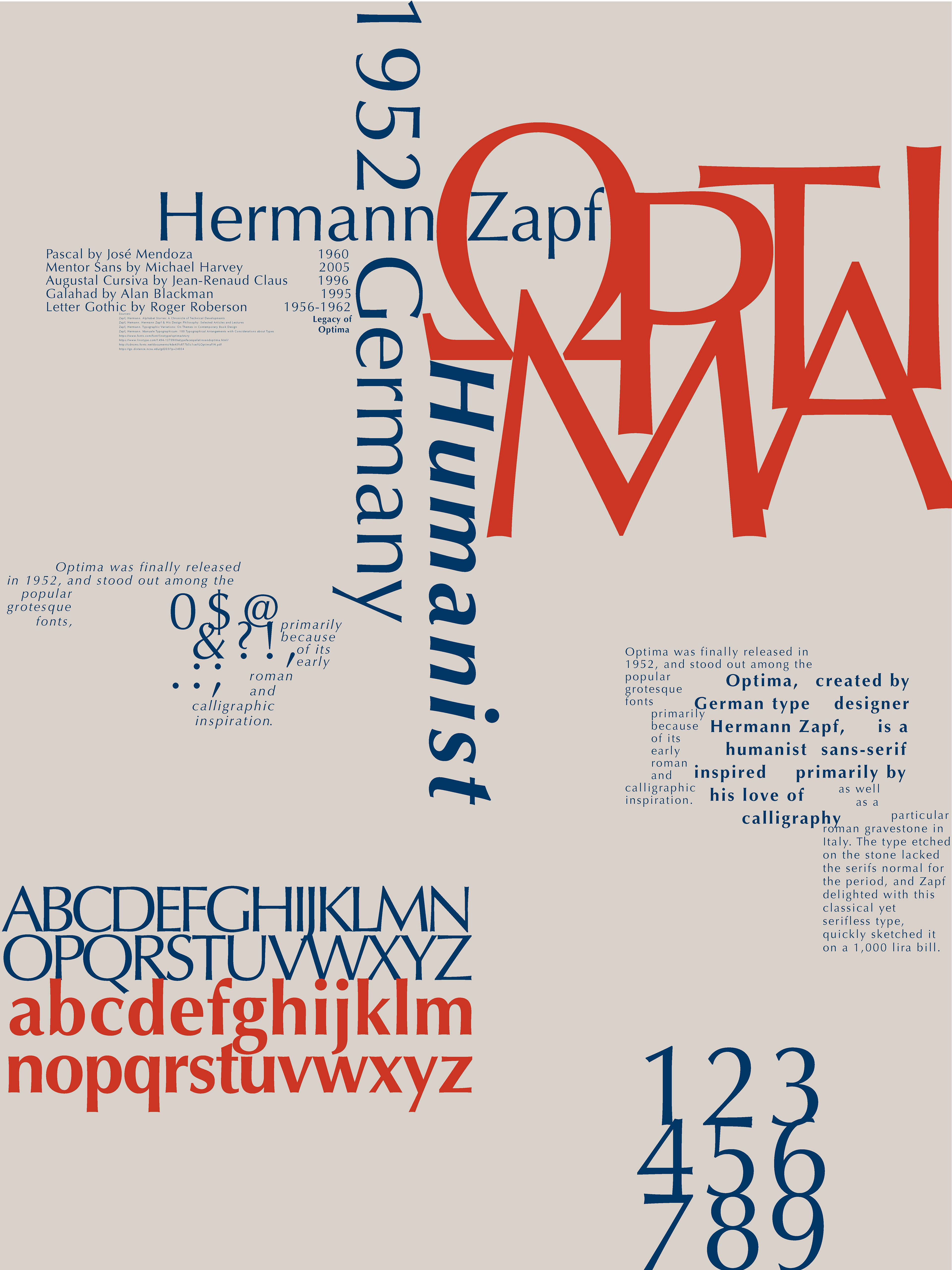
For this project I created two posters showcasing a couple of fonts I find interesting, with a short paragraph giving historical significance. These posters were meant to be practice in modern and experimental typographic compositions, and I learned quite a lot in their creation. In poster one I set out to evoke Hermann Zapf's calligraphic style using digital type, more specifically the font he created, Optima.
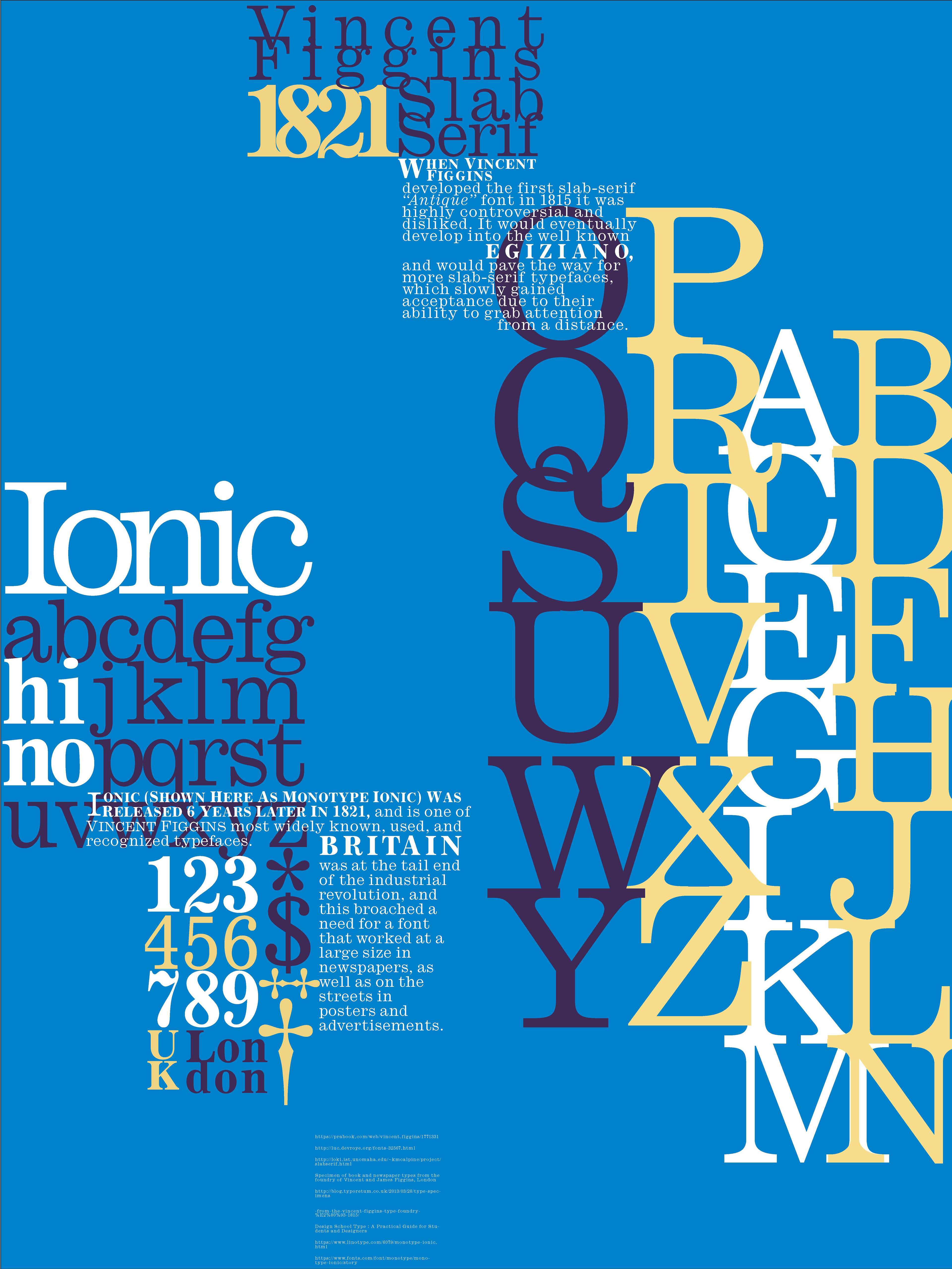
Carrying that thought into my second poster, showcasing Vincent Figgins Ionic typeface, I started with the type specimen as the most focal piece in the composition. The arrangement of the large blocky slab-serif on the right was crucial, with consideration put into every place they touched and the negative space the individual pairs of letters created. In addition because this font was not printed in color historically, I had some freedom to choose colors that added a bit more pop.